2AM aims at female fans with new logo
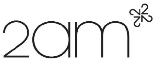
Group 2AM recently unveiled their new logo on their official website and announced that they would be back soon.
In a teaser video, which was released on February 28, Chang Min narrates, “It’s been one and a half years since we broke up. I tried to manage and comfort myself. How do I look? I’ve been like this these days.”
Chang Min’s emotional narration tells people how hard they tried to make a logo which represents the group’s emotions. The new logo is made by Total Impact, one of the best design companies in Korea, which has created many logos for companies, including Hyundai Card Privia and SK Telecom.
Oh Young Sik, president for Total Impact, says, “It was very difficult to make a logo which shares emotional feelings with the public. We needed to use our imagination to make a logo that represents the music.”
He also talked about what he thinks is the most important part of the logo. “Since 2AM has a lot of female fans, so we used a feminine and sensitive ’avant-garde’ font.
2AM will release their mini album on March 12 and will return to the performance world in a year and a half.
- Any copying, republication or redistribution of STARNEWS’s content is expressly prohibited without prior consent of STARNEWS. Copyright infringement is subject to criminal and civil penalties.
- English
version: cnkinvestment.com


